Thursday, February 27, 2014

Abstraction and Representation

"Abstract literally means to draw from or separate. In this sense every artist is abstract... a realistic or non-objective approach makes no difference. The result is what counts." - Richard Diebenkorn

"Of all the arts, abstract painting is the most difficult. It demands that you know how to draw well, that you have a heightened sensitivity for composition and for color, and that you be a true poet. This last is essential." - Wassily Kandinsky

"Objective painting is not good painting unless it is good in the abstract sense. A hill or tree cannot make a good painting just because it is a hill or tree. It is lines and colors put together so that they may say something." - Georgia O'Keefe

"There is no abstract art. You must always start with something. Afterwards you can remove all traces of reality. There's no danger then, anyway, because the idea of the object will have left an indelible mark." - Pablo Picasso

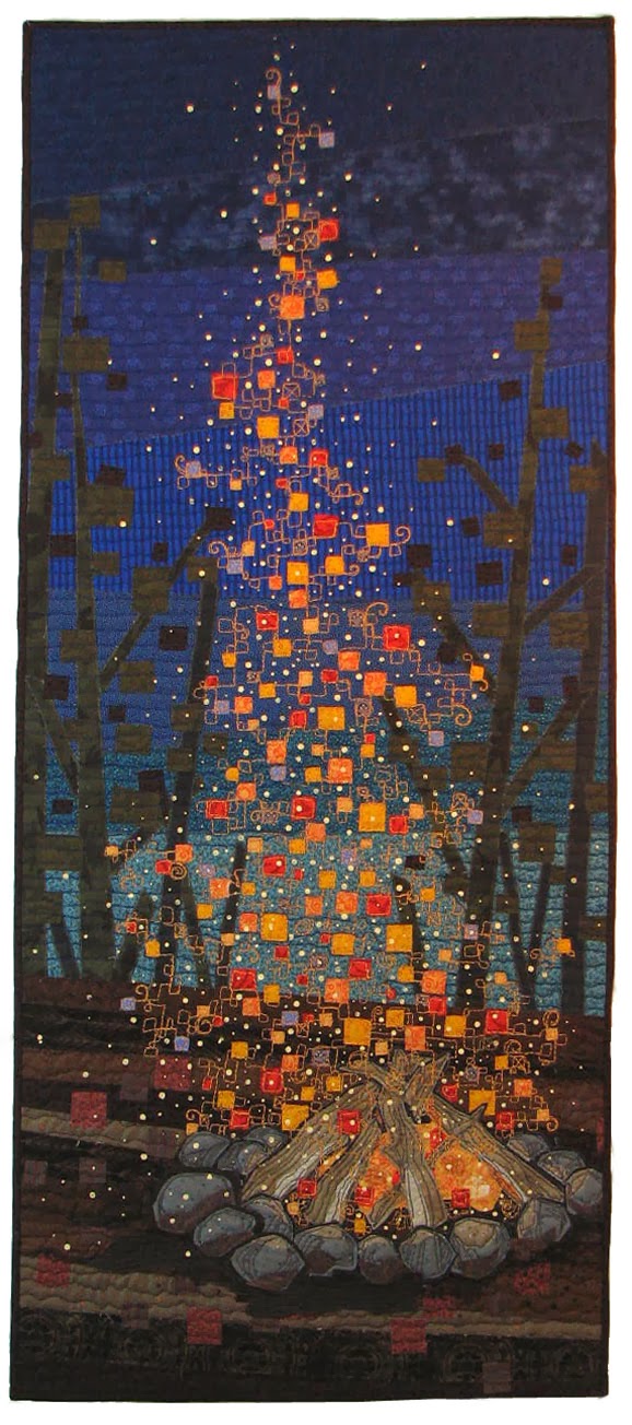
I have been thinking a lot lately about the ideas of abstract art and representational art, as if they are two entirely different things. Within the art quilt community there seems to be a clear distinction made between the two, but I have always believed that the differences are often hard to clearly define, if they should be defined at all. My quilt, above, depicting a fire—is it abstract or representational? I would say "both." It represents a fire, so, yes, it is representational. But it is not a realistic rendering of a fire. It is a pretty seriously abstracted expression of a fire.

Recently I went to see the exhibit of our High Fiber Diet show "Simply Red." It is hanging in a venue where there are two separate hanging areas—one on the upper floor of the building, and one in the basement area. I was told that the hanging committee had decided to hang all the "abstracts" on the upper floor and that my piece (above) was in the basement with the rest of the "representational" pieces. "How odd," I thought, not because the basement seemed like a less desirable place to be (it isn't, in this case) but because it seemed such an arbitrary way of grouping the work, and rather than hanging the show to create interest and flow, it seemed to have been hung in a way that categorized the work in a State Fair sort of way. They could just as easily been all the small pieces together and all the large pieces, or all the pieced work together and all the appliqued work together, or hand-dyed fabric work together and commercial fabric work together, and, and, and... none of which would have produced a harmonious flow. (Hanging a show is an art in itself) But somehow the differences between abstract and representational, or as some even more erroneously call it "realistic" work seems to be a very real thing in many artists' minds. A teacher once told me that all art is abstract, in that it is not the real thing, but rather paint, or fabric or marble, and the illusion of reality is truly that—an illusion, an impression, a memory, a dream, a starting point. I like to think of abstraction as a scale that travels from very representational to totally non-representational, with most art falling somewhere along the in-between spaces. Myself, I travel back and forth within a section of that scale. I don't think I would need to go too far in the "less" direction to find myself upstairs with the abstracts. But I hate being categorized. Does one make a decision to be abstract or representational? I guess some do. I prefer to think that most of us do what we do, the best way we can, and the results speak for themselves.

Someone told me they thought that fabric "lends itself better to abstract work." I think many fabric artists believe that doing something that is very abstract is easier than representation. I think doing good work, regardless of how representational, is hard. I like Georgia O'Keefe's quote at the top of this post and think it applies in the reverse as well. What do you think? Do you see clear differences between abstract and representational art? Is one "easier" than the other? Do you see biases toward more or less abstract work in the shows you enter? Do you prefer one over the other? (I don't. I love a good abstract-y abstract and a poorly done very representational piece makes me cringe! And vice versa.) Can I convince you to think differently about what "abstract" means?

Tuesday, February 25, 2014

Fireplace Upgrade


after
In the ongoing project that is our house, the fireplace really needed something—fire. It was a wood-burning fireplace that we stopped using after only a few fires. It made the house, and everything in it (including us) smell like a campfire for days, and made eyes burn and throats scratchy. Flawed design. We've missed a fire. The old place can be a little drafty, plus a fire is just nice, ya know? So we had a gas insert installed and it is great. And I really like how it looks. I was afraid a gas insert would look too slick and obviously fake. 

before
Here' s how it looked before. The brass screen and doors were OK, but a little fancy—those are brass leaves twining around the glass doors. They look, honestly, like poison ivy leaves. The mantel, such as it was, was a narrow shelf. The previous owners had it painted blue.  I repainted it brown, which was a little sad too. I thought the black insert would look quite handsome with the brick. I shopped around for a new mantel and found nothing really suitable, so I ended up adding more wood to the existing mantel/shelf to give it more substance, and painting it all black. Done. I love it. 


My Mom's Chinese mud men and my old Japanese ceramics seem to feel happy with their updated perch.  The story of the old quilt, hanging above, can be found here.


Sunday, February 23, 2014

Digital Drawing Day - Two Domestic Items Having a Conversation

This was an especially fun theme and I think our resulting "paintings" definitely live in the same world!

Terry


"Hey, French Press! Long-time-no-see!"

"Oui, Scoopy. Zey barely remove me from ze cupboard zese days. Zey have fallen for Monsieur Coffee."

"Yeah, it's true, sadly. Mr. Coffee is quick and efficient, but his attitude really scalds my beans, if you know what I mean...  But it looks like we have a coffee date this morning. I think the lady of the house has a little crush on you."

"Oui, she has always been partial to my red beret. So, Scoopy, let's give her a cup of ze cafe to remember!"

"You got it! See you after the grind..."

iPad, ArtRage, New Trent Arcadia stylus

After finishing this, I downloaded the "Glaze" app that I have seen Pat Gaignet use and gave my painting the Glaze treatment., so I am including it for comparison.


June


 "Hello there Red, you look a little wobbly."

"Oh yes, we started early today. And we mixed a bunch of different reds. It's unfortunate. Of course, you'll bear the brunt of it when the spaghetti toppings get thrown at you."

"Oh no, they won't put the toppings into the colander? They wouldn't -- would they?"

"You've never seen what happens when bad cooks starting in on the wine early. Believe me, I've seen everything."

"The last place I was in nothing like that ever happened."

"Wait until they put you in the dishwasher."

"Oh -- is that why you are a bit, um, scratched?"

"Don't mention it. Just don't mention it. OK?"

Art Rage, New Trent Arcadia stylus, tweaked in Photoshop with wacom
***********************************************
Vicki Miller is following us and has posted her own digital work on her blog at: http://victoriaedm1.blogspot.com.au/2014/02/technology-oh-my.html

Take a look!

Next Week's theme, seemed a no-brainer, following this week - "Food" 

Friday, February 21, 2014

The Old Dog, New Trick thing

I don't know if anyone is enjoying the digital drawings that June and I are exchanging every Sunday,* but I sure am. This drawing on the iPad has opened up a whole new world for me. Why, you might wonder, am I doing it and what does it have to do with the fabric art that I do? Well, I sort of think that all art relates to all art. The iPad drawings are the same kind of exercise for mind and eye that drawing with a pencil is, but because it is sort of novel it gives me yet another way of seeing and working things out. I am having a lot of fun discovering how it all works and the tricks of getting particular kinds of effects.

In the interest of full disclosure, just so you don't think I have learned all this in just a few short weeks, I have to remind you that I have been using digital tools for illustration for a long time. My pre-retirement profession was graphic design and I used both Illustrator and Photoshop for years, so the fundamentals were in place. (Here is a post I wrote a couple years ago about Illustrator)  But the iPad and the drawing apps are a bit different—designed to make the experience less mechanical than Illustrator, for example, and more like working with paper and traditional media, yet with the cool advantages that the digital media offers. The apps I like include Sketch Club, Artrage, and Brushes, which I haven't used a lot yet, but it was one of the earlier drawing apps and the one David Hockney uses. With these I use a New Trent Arcadia stylus, which I like quite a lot.

Today I downloaded a new app called Glaze, which is not actually for drawing or painting, but takes a drawing made in another app and applies a variety of effects to it. You can also use it on photos to make them cool and painterly. I had to try it out on something, so I quickly drew a simple, crude little vase, using Sketch Club. Here is my original drawing.

Then I opened it in Glaze and added different effects. These were my four favorite, right out of the box.

Pretty astonishing, in my opinion. There will always be painters and fine artists, but I really think the digital stuff will revolutionize the commercial, illustrative art world. For me, it is keeping my brain and hands nimble and making my brain wrap around a whole new way of working. I don't know how it will affect my other art work, but I just bet that it will. I am an old dog and I am learning new tricks and it is a little bit exhilarating!

*My friend June Underwood, who is a painter, and I post a digital drawing on my blog every Sunday. It is a small challenge to each other to keep learning and growing. We propose a theme that we use each week. We welcome anyone to play along with us. Send me your digital drawing or a link to your own blog or site. Use our theme or do your own thing. Tell us your experiences!

Thursday, February 20, 2014

Rejected, but in good company

Yesterday the Portland SAQA (Studio Art Quilts Associates) group met and got a look at some of the pieces that were not selected for the upcoming SAQA show called "Exploring Layers." I suggested we might do this because there were more pieces rejected than accepted and rejection is hard and misery loves company and it is just a good thing to share one's failures along with the triumphs. We all feel better when we know we are not the only ones. Besides, we all worked hard and hopefully on these pieces and it would have been a shame if no one ever saw them.

  
This was my entry, called "Layers of Culture, Layers of Time." You saw me struggle with this piece. I was never really satisfied with it, but I felt it was worth submitting. Looking at it now I actually like it better than I did when I finished it.

I don't know why it was not accepted for the "Layers" show. One rarely knows what is in the mind of the juror. Since I have been laying out the catalog for the show I have seen photos of what was chosen and I think this piece would not have really harmonized with the rest. The choices ran to more abstract, visual layering sorts of things. It will be a good show, without me! It is always easy to make yourself feel better to just decide that your rejected piece simply didn't play well with the rest of the show. And that might be the truth, in fact. It is also possible that it just didn't stand out in the crowd and could have been more appealing and wasn't your best work. I think it is always useful to consider how it could have been better. This is really a big piece and I think those large sizes are hard for me. I wanted to simplify the shapes and in doing so I think it became rather static. I also lost the effects of the combinations of the fabrics that play off one another in small pieces when I chose to use fairly large pieces of the fabrics. It is visually "flatter" than I had hoped.

Several years ago I was involved in helping to jury a show for High Fiber Diet. One of the artists whose work was not accepted became angry and demanded to know "why." She was told that her piece simply did not fit with the rest of the show that was chosen. She left the group, hurt and defeated. I have never forgotten that and still feel badly for her, but it provided an insight into the dynamics of acceptance and rejection and I vowed never to let myself be that defeated by one rejection. It is part of the game. It is a kick in the gut, but an opportunity to critique yourself and live to try again.

I think we all enjoyed sharing our rejects. I think it felt good to know that we were in good company. Some of the pieces were lovely. Some not so great, but we turned the session into a learning experience and even had a few laughs when one member showed her piece and joked that she planned to cut it into three table runners.


Here, Gerrie shares her rejected leaf design piece.  Another flawed, but lovely-in-some-way, quilt. This one has a future—with a few modifications.

I left feeling oddly uplifted and supported, as well as a new fondness for my ugly duckling quilt. With all its faults it is kind of vibrant, don't you think?

Sunday, February 16, 2014

Digital Drawing Day - Black and White

The digital drawing project continues. My friend, June, and I are posting a drawing made on our respective computers or digital tablets each Sunday. We present these as a learning process, hoping that we will see improvement as we go along! Some weeks are easier than others. It's a big topic. You are invited to play along and send images or links to images you have created. You can use our posted themes, or invent your own. If you've made some great discovery about how this all works, by all means let us know! 
 

 June
"'Black and White' was a difficult assignment for me. I thought about sketching the figure (because figures are often done in black and white); I played with some difficult domestic objects, paring them down as I realized I was in over my head; I kept simplifying both my subject and the tools. It was still difficult.

I decided to stick to simple shaped subjects, using only the digital tablet and its apps (later the rule of the digital tablet was rejected). My object was to find if I could draw a successful line from a real
object on the digital tablet. At that I failed.

The most successful of the lot is a copy of a famous Japanese ink drawing, "Six Persimmons." I copied a painting because the composition and basic questions are already resolved. However,  I never did get a decent line, even when I moved to Photoshop on the desktop with the Wacom stylus.


MuQi, Six Persimmons, Android tablet, Art Flow, Photoshop and Wacom Stylus

By Saturday, I was in trouble, so I used the whole day to my homework. I chose a soup tureen, a simple shape, tried doing it on the tablet four or five times, failed four or five times, and finally went to pencil on a sketch pad.


Soup Tureen 1, pencil on paper, tweaked ArtFlow and Photoshop with Wacom stylus to bring out the contrast.

In despair over the tablet drawings and the pencil sketches, I turned to my digital canon camera and my laptop which has ArtRage on it. ArtRage was a relief: I had spent about 4.5 hours failing to get anything I could live with on the tablet with the Android apps; in 1/2 hour on the laptop with ArtRage (and a photo of the tureen), along with a bit of tweaking on my desktop with Photoshop and the Wacom, and I got what I am most comfortable with.


Soup Tureen 2, traced from photo on laptop using ArtRage, then transferred to Photoshop and tweaked with the Wacom pen.

What I learned: I am much more comfortable with real graphite and pencil than with digital "brushes" and styluses, in part because I can use my fingers to smudge the graphite. I have not found an app the does the same (Another arbitrary rule: no digital smudge tools. Nevertheless, I found substitutes, especially in ArtRage). I have trouble successfully using the hard-edges and lack of nuance of the sketch tools on the tablet. I did not know that black and white makes the edges even more
evident than color. I came to the (duh) realization about contour lines -- that their only purpose is to establish spaces and in my mental visions, they don't really exist. I really like the tablet app setting
that smooths the lines (such as exists, I believe, in Adobe Illustrator); I can't find in such setting in any of the Android apps but there it is in ArtRage. Finally, If anything could persuade me to
change to an iPad, it would be the ArtRage app; apparently Apple has blocked turning it into an Android app, and ArtFlow is, for my purposes, inferior.

For the original photo and then more info about Six Persimmons, see:Six Persimmons, Mu Qi
http://www.indiana.edu/~ealc100/Art8.html

http://dharma-documentaries.net/james-cahill-on-chan-painting-5-muqis-six-persimmons


Terry
The Crow
I wanted to try to create something like a conventional drawing using the digital drawing app Sketch Club. Like June, I am somewhat put off by the hardness of the line one gets using the regular brush or pen tools, so I experimented with using the brush that looks like a chalk line, narrowed down to a fine point. I was happy that it seems to create a softer line.

I started with a photo of the crow on the bottom layer and sketched in the outline features, than began a scribbly sort of drawing to get the effect of the feathers and shading. At this point I cleared the photograph from its layer. Once I was finished using the very fine line it seemed to be suffering from a lack of contrast, so I worked a bit of bolder, wider line scribbles on an added layer and when I saw that I liked that, I merged it with the other layer. The shadow was created on another layer using the same chalk brush, but much wider, then adjusting the opacity of the layer to get it to the value that I wanted.

iPad, Sketch Club app


I was curious to see what this would look like printed, so I printed it on a sheet of nice, cream-colored  drawing paper, using my inkjet printer. It could pass for an original, drawn with a permanent marker.

*******************************************************************

Next week's theme: two domestic objects that "speak" to one another

Saturday, February 15, 2014

Valentines

It is Valentine's Day for about 15 more minutes, so I thought I better hurry up and wish you all a happy one. I hope it was a great day. Good day here. The grandchildren loved it and were very sweet with their valentines. Marco, 3, had what seemed to be a special one to show me. It was from "Gracie," a little girl he goes to daycare with. My daughter had some wonderful valentines and messages from her students. She is grappling with the fact that she and her fellow teachers here have voted to strike next week. It's a difficult thing, standing up for what you know is right, but important. I feel like there is a lot of public support for the teachers, but there are ugly things being said, as well. They can't let it get to them. She worries about her students most of all.

The impending strike, some heart-wrenching news and the aftermath of our big snow storm have made for a challenging week around here. Good to end it with valentines and love and chocolate.

I have shared my valentines here before. I make them every year and send instead of sending cards at Christmas. I had pegged last weekend for getting the prints made, then putting them all together and addressing them. That would have involved going to FedEx for prints and buying paper and envelopes. I would have had plenty of time to get them in the mail, but it snowed and snowed and snowed last weekend and we didn't leave the house and the valentines didn't get done. They were finished last night and in the mail today. If you are waiting for one, they are coming...


Did I ever tell you that I met Ray the day before Valentines Day, 44 years ago? It was a Friday the 13th. Don't believe what they say about Friday the 13th.

Love, Terry

Sunday, February 09, 2014

Digital Drawing Day - Bread

Terry


I ended up making two drawings this week. I kept thinking I should go buy a loaf of bread to use for a model then decided I could surely remember what bread looks like! The bread theme got me thinking about textures and surfaces, so I was interested in working on creating a reasonable texture for the cut face of the bread and the smoother, but also interesting surface of the outer crust. I did come up with a pretty nice texture for the bread, using one of the spatter-y kind of brushes, but in the end the drawing was so boring that I decided it was only fit for experimentation, so I tried out some of the Sketch Club filters and settled on this posterizing filter, which did make it considerably more interesting.


Early in the week my granddaughter brought home a lovely, bread-y pretzel that she had made herself, at her after school program and the shiny crust and added salt seemed like a great challenge, so I drew the pretzel and created shine with the airbrush tool and salt with the same spatter-y brush I had used for the bread. Somehow the salt looks almost like glitter more than salt, but overall I was pleased with my results.

iPad, New Trent Arcadia stylus, Sketch Club app

June


I began this week thinking I would attempt to be more "graphic" -- to use lines and contours and stop mooshing things together like a bad painter.

So much for that thought.

But thinking about the lines made by pencils and pens got me to thinking about other kinds of lines, ones connected with bread.

So I'm thinking of this as "lest we forget..."


Pencil sketch (from internet photo), uploaded to ArtFlow (which accounts for the odd color of the background) and modified, uploaded and traced breadline photo.

ArtFlow, Photoshop, New Trent stylus, Android Note, Wacom desktop tweaks.

Next week's theme: Black and White  - interpret any way you choose

Friday, February 07, 2014

Snow and the Blue Dress

It really is a little silly how excited we get about snow here in NW Oregon. It is a rare occurrence and we get kind of giddy and anxious at the same time. I know people in other parts of the country that are buried under it must be rolling their eyes at our stupefaction, but it is kind a big deal here. Beautiful, to begin with. Just so beautiful. And then treacherous and  truly dangerous when you are out in an automobile because our cities and our cars and their drivers are unprepared for snow. Snow plows are nonexistent and nobody has snow tires and everybody has chains, but I'll be darned if you can find them because they haven't been used in, oh, eight or so years. And that was a different car and the chains, when you do find them, don't fit the current car. Then what happens is when the snow starts to look like it is sticking and going to be coming down for awhile everyone panics, the schools close and everyone gets in their cars and heads out for groceries or to pick up kids or leaves work to get home before it gets really bad and all 2.25 million residents of the Portland metro area are on the road at the same time.

Yesterday I went to pick up Sofia when her school closed and it took us 2 hours to get home. It is normally a 15 minute drive. It wasn't the snow. It was the traffic. Part of our route was past the Nike World Headquarters and everyone there was deserting the premises en masse as we crept past the grand campus.

This is the corner near our driveway. Off and on all day yesterday and today there have been police and tow trucks there because drivers heading up the hill road on the right keep sliding off the road. I just looked out the window and there is another tow truck there right now.

But once safely at home it is something special, that snow. It really is. My grandchildren, who had no school today, spent the whole day sledding and joyously playing in the snow. I spent the morning drinking coffee and watching the birds at the feeders out my front window, then I went to the studio in the afternoon.


I am making progress on my "blue" quilt. A blue dress was what finally got me interested. A memory of a blue dress that I loved—that I wore to school on the first day many years ago. Did you ever have a piece of clothing, as a child, that seemed just right? That blue dress was it.

Of course there will be more—a whole story as it were. But I started with the face, and then the dress. When there is a person in your work I always think that is the place to start. You want to know, right off the bat, who you are dealing with. So, face, dress, arms, legs, pencils and shoes.

It's a start.

Sunday, February 02, 2014

Digital Drawing Day — Plant Material

Here we are on our third week of our digital drawing challenge. This week's challenge was "Plant Matter."

June

Terry's "assignment" for the week was "Plant Matters" and I suddenly became fixated on the variety of plants that I've depicted in other media.

I began with (something like) Plant 5 (in the east side industrial district which I painted in panels a few years ago.

And in front of my eyes in the front window are the amaryllis that we always start at Christmas time, too late to bloom then, but a joy in January and February. Years ago, I painted a bunch of amaryllis on silk. I even quilted a few of them (and just sold some others). So doing a smooshy Art Rage paint job on the pink amaryllis seemed perfect.

And in between the amaryllis and the industrial building I placed the scene across the street, behind the amaryllis and in front of the industrial building, trees in their winter gauntness, organic in form,
but without any lushness. I've painted this kind of tree often.

The industrial building was traced from a photo and then mangled with SketchClub, the trees painted from memory with SketchClub and a little tweaking with ArtRage, and the amaryllis was painted "plein air" (or on-site, or from life) with Art Rage, with a snitch of Photoshop intervening when I got stuck. All were worked on layers, which I actually remembered to use often this time.

Toshiba stylus and wacom tablet and pen.

Terry


I decided to approach this drawing in a little different way from the others I have done. The layers function in the Sketch Club program gives you the option of placing or creating layers that can serve as guides and then be discarded. Last week I used the option to start with a photo on a bottom later, that was later discarded. This time I decided to start with a rough sketch of my succulent plant sitting on a tile-topped table. (see the photo below) That approach worked well. Then, using the sketch as a guide, I stared creating the tiled background. Then I completely fouled myself up! I intended to draw the pot and the plant on a separate layer in front of the background, but inadvertently drew it on the same layer and cut off my options for refining the edges and adding shadows behind the pot. Oh well, I pushed ahead anyway.

There are some things I don't really like about this, one of which is the black areas that are a little too black, but I learned a lot with this piece and I like the effect that the speckly brush gave the plant leaves. Overall it may be a little overworked.

iPad, Sketch Club app, New Trent Arcadia stylus, tweaked in Photoshop to adjust saturation and contrast.

Here's the preliminary sketch. It really helped to get the perspective of the tiles and main elements of the plant in place.

***********************************

I am really gratified by the interest this project has generated. I got a great drawing from Laura Kemshall, who wrote: "You suggested a theme of plant material, I love poppy seedheads and so couldn't resist joining in. I've attached a drawing which I did with Procreate on the iPad. Can't believe I've not done more work on the iPad before - I love it!"

Here is Laura's beautiful poppy pod:

 I think this is so simple and elegant and, of course, so representative of Laura's work. If you are not familiar with it, treat yourself to a visit to her blog www.laurakemshall.blogspot.com

Thank you, Laura!

My friend, Susan Gallacher-Turner is also experimenting with her iPad and sent me a link to her blog:  http://sculptingalife.blogspot.com/2014/01/drawing-digital-surprising-new-art-tool.html  She is definitely having some fun with the drawing apps!
 
***********************************
Next week's theme, from June: "Bread", in any sense of the word.