
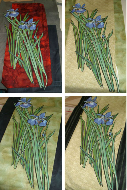
 I'm back, and Blogger is letting me post pictures again. I decided I wanted a background for the iris that would be simple—a strip of fabric with a narrower strip of a different fabric down each side. I want the suggestion of an Asian scroll.
I really thought I would like something quite dark for the side pieces so that was what I was thinking. The red hand-dye was certainly dramatic, and it brought to mind van Gogh's irises, but ultimately I felt it was too much and I wanted something more serene. I was surprised that the dark panels were not working for me either and I ended up trying out the two green fabrics together and that is what I settled on.

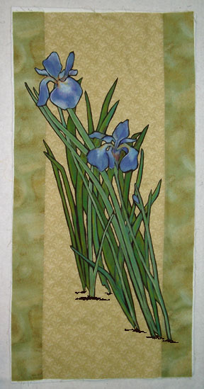
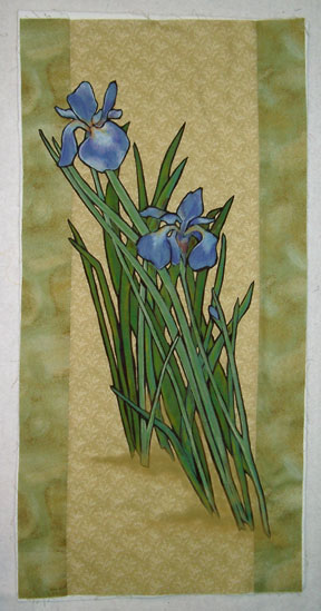
Once I got the irises fused to the background I realized that they were floating, not growing. They needed to be grounded somehow.
This is where I love Photoshop. I can take a picture of a work in progress, put it into Photoshop and try different things without committing them to fabric.
Maybe the irises needed some little dark lines that would indicate the ground they are growing out of. They could be fused, using the same dark brown the irises are fused to,
but first I can just draw them in my photo.
Ummmm—no. That's not going to do it.
Maybe I need to get in there with my pastel pencils and put some shadow and color into the background to suggest ground.
Yes! I think this is going to work. But this is still just Photoshop magic.
Tomorrow I will show you how it works out on the real thing.
Fabulous Terry....as usual! I too prefer the softer scroll edges. I think the darker color was too much of a contrast, and it pulled your eye away from the focal point.
ReplyDeleteGood news, too... found 8 bottles of Liqui-Fuse on sale at the Michael's in Augusta (Maine), along with a bottle of a product from Aleene's that apparently allows you to reposition the applique... sorta like the sticky seam a seam (which one is it that does that? 2? I don't care for the S-a-S, so don't know) in a bottle. Will let you know how it works!
Looking forward to the next step.... Cheers, Sarah
Iwonder whether a few vertical lines - indicating the Iris's were growing in grass might be effective?
ReplyDeleteJust a thought from a total amatuer!
This is beautiful. I don't have any ideas for your delima but I understand what you mean by the iris's looking like they are just floating. I llok froward to seeing the solution.
ReplyDeleteI can finally see the photos. This is really nice. have you found a solution yet? I do think a way to ground them would be nice.
ReplyDeleteI think the softer brown at base of flowers creates the flow you're looking for. The choice of subtle palette rather than bold edging works well ... it's more zen-like, meditative.
ReplyDeleteWhat if you anchored them in water, a vase? It may detract from the Japanese flavor though ...
Gosh, you are so gifted!
And you've hooked me on the "iris" theme because my newest grandbaby who is to arrive in July may be named Iris!
I may have to commission a private work if that happens :>)