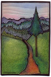
 Now that I have retired from one of my jobs, I really do plan to do more artwork. I told my friend June, that I might even do something big. She expressed skepticism. Today I spent the day making postcard sized pieces. It's a start.
Actually this is something I have been thinking about doing for awhile. Virginia Spiegal, who is on the QuiltArt list started Fiber Art for a Cause about a year ago and has been auctioning fiber postcards to benefit the American Cancer Society. She will be selling them at the big Quilt Show in Houston this fall and is soliciting QA members for donations of cards. All the proceeds go the ACS. It's an important cause. Both of my parents had cancer. My Dad died of a particularly nasty one—pancreatic cancer. So, better late than never, I am making a few cards to contribute.
 Today I made two small landscapes. The first one is called "High Country" and the second is "Sagebrush Country".
A lot of the donated postcards are very heavily embellished, with beads and shiny threads and sparkly stuff, so I'm not sure these will fit in real well, but they were fun to do. But after I finished the second one I had another different idea I'm going to work on tomorrow. Of course I will show the results here.

These are gorgeous and unique!
ReplyDeleteI'm sure the idea is to create art that someone will insist on owning -- these will definitely fit that requirement! What a wonderful contribution to a great cause!
ReplyDeleteThese are gorgeous. I don't like the heavy embellishments because they can't be mailed as easily. I'd buy these in a heartbeat!!
ReplyDeleteThese are simply beautiful.
ReplyDeleteStunning! A very lucky buyer will stumble upon these and be delighted.
ReplyDeleteI really like these. They remind me so much of Southeastern Idaho. I would love to have a set. Please let me know if they will be on sale at a site or place where I might purchase.
ReplyDeleteI do love these little landscapes (although "Bright Berries" could come live at my house too) with their beautiful, muted colors and wonderful perspective. Your fusing technique that allows the black to show really sets off the elements of the design too. Beuatiful.
ReplyDeletewonderfull postcards
ReplyDeleteInge in Denmark
www.123hjemmeside.dk/ingesol