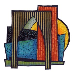
 OK, so this is the idea that I have been pondering. Some sort of architectural thingie. Some sense of structure, but in the abstract. This is small. It measures about 5.5" x6" and I think it is supposed to be part of a larger, though not too large, piece.
I scanned it and opened it in Photoshop to fool around with. Here it is on a larger background. I think it is overwhelmed by the background.
 Here's another version. Smaller background—same basic shapes as the other one. Darker colors. I think I like this better. I'm still thinking.

I agree with you...in the first one the scale is off and the black border in the second one works to keep the eye contained on the focal point.
ReplyDeleteOh! I like this. ou are right - the first is woo overwhelming. It still has your signature on it - you are not veering to far from the Terry brand!!
ReplyDeleteTerry,
ReplyDeleteI like the piece as it is without a background. When I first looked at it I thought it was finished. The uneven edges accentuate the architectural feel.
No matter what you do it reminds me of the Sydney Opera House.
ReplyDelete