Here is Emily talking with Allan Oliver about the show. If you are in the Portland vicinity, I urge you to see the show. My photos don't do the paintings justice. It will be at Onda through October 24. Onda is located at 2215 NE Alberta St.

Here is Emily talking with Allan Oliver about the show. If you are in the Portland vicinity, I urge you to see the show. My photos don't do the paintings justice. It will be at Onda through October 24. Onda is located at 2215 NE Alberta St.
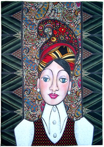 I tried out all kinds of backgrounds for this crazy hat lady. Nothing worked until I tried the paisley. Yes, it's a little, um, busy. But I just went crazy with the prints and I do love the richness of all that pattern. I think pattern is where my head is these days.
Did you know that the teardrop design that came to be known as paisley originated in India more than 2000 years ago? It got the name "paisley" in the early 1800's when Scottish soldiers serving in India brought back shawls in that design. The design was copied by weavers in the Scottish town of Paisley and they made the shawls quite popular.
Last week I showed you this pillow I made from a placemat. I think this paisley is quite fresh and modern looking. 
I have to say I am especially fond of red paisley. These cushions are on my diningroom chairs. 
About 14 years ago I bought a couple yards of this Liberty paisley print. It has been in my stash all these years waiting for just the right project. Today I cut into it for the first time. It is exactly the right thing for something I am working on. One of these days (soon) I will show you.

John Lennon owned a Rolls Royce that was painted with a paisley motif.
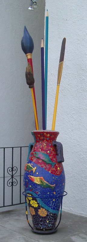 Another impressive thing we saw in Richland last weekend was Allied Arts, which is a community arts organization and gallery in Richland. They have a nice building near the beautiful park that runs along the Columbia River. I loved the mosaiced pot with the brushes that stands out in front. The steps up to the door have similar mosaic work on them.
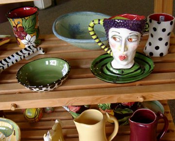 I took this picture of some of the work that was for sale, then I saw the sign that asked that no pictures be taken. Oops. I loved that mug with the face on it, though, and just had to share it.

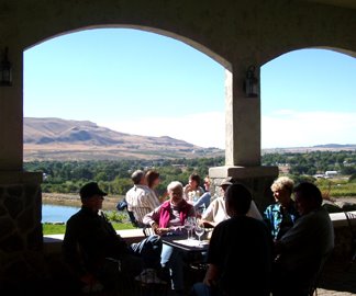 The next day we headed out into the countryside to taste wine. It was the weekend of the "crush" with lots of local wineries participating. Wine-making is a fairly recent innovation in the tri-cities area, but there are dozens of wineries around. We tasted some good and some pretty ordinary wines and saw very fancy wineries built to look like French Chateaus and Italian monasteries as well as wineries that were more along the lines of metal farm buildings. It was a fun day, the sky was incredibly blue and a good day to take pictures.
 At one of the wineries they had an exibit by the artist who designed the wine label. It turned out she was a fiber artist. She shall remain nameless because I thought her work was, ummmm, shall we say "disappointing".
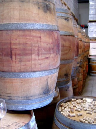 All in all, it was a lovely day.
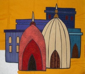
 I decided I wanted to finish the edges of the Domes quilt with piping. I took the piece, along with a sample of the piping I made, to my small group last week to get their opinion. They liked the piping, but someone said, "how about the corners?" I assured them that I thought it would turn the corners just fine. I sewed the piping on and, guess what? It really didn't turn those corners fine. It really rounded them off and I didn't like that so much.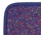
 So I picked the old piping off, I went to the fabric store and bought some narrower cord and came back and made narrow piping. Much better. Now it is finished, though I may come up with some interesting hanging rod for it.
 Or maybe it's "when someone asks about the corners, they might be onto something."

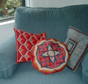 I've been thinking about how you quit seeing things that are right in front of you when you look at them long enough. I have had these little pillows for years. I made the two bargello ones probably 25 years ago in a fit of needlepointing. I made the other from a Ginny Beyer fabric that I liked at least 15 years ago. They are all small and relatively hard and the needlepoint is getting quite threadbare and you can see the canvas through it at this point. The photo is flattering. They are actually rattier in person.
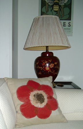 My sweet sister-in-law, Brenda, may have noticed the tired condition of my pillows because she brought me this beautiful pillow when they came to visit this summer. It was designed by a designer named Janie Gross who has a line of pillows based on dried flowers. It looks so good (see how cleverly it relates to the lamp?) that I decided the old, tired pillows had to go.
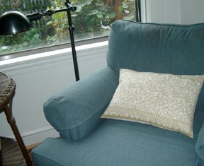 Here is another new pillow, with a larger, squishier size and a brighter look. I made this one from a placemat that I bought at CostPlus. I just love the paisley pattern. I opened the seam on one end and stuffed fiberfil between the front and the back, then sewed it closed again.
Well, it turns out there is also a Japanese porn star by the same name and there are many, many links to sites featuring that Reiko Yamaguchi. I imagine my site about quilting is not exactly what most of the folks Googling Reiko are looking for.
Probably the second most common search, and this is just plain peculiar BTW, is for "clog wearer". Last spring I showed pictures taken at the Garden Show where we sold garden art. Included was this photo of footwear seen at the garden show.

The red clogs in the lower right corner are mine and those are my feet. This entry got me listed as a "clog wearer" on a site that is all about, well, clogs. See my name at the very bottom of the list? Who knew?
P.S. OK, this is pretty funny. (Or sad) Three hours after posting the above, I just checked the site meter page again. Someone just found my blog by Googling "Japanese Porn." Google sure works fast doesn't it? I'm amazed.

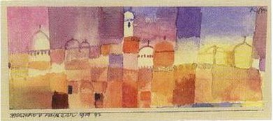 Continuing on with my architectural theme, I had an idea of domes. It may have had something to do with the research I have been doing on Paul Klee. I am leading a discussion of Klee on the raggedclothcafe list this month. Klee had a turning point in his art and his
  use of color when he visited Tunisia in 1914. That is one of his Tunisian paintings at the upper left of this page.
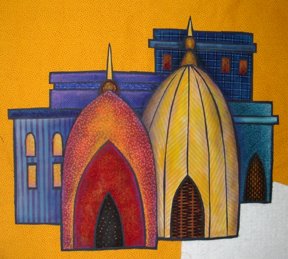 I like the way the yellow stripes chevron in the bigger dome, but eh, that color really looks dead. So that is when I get out fabric paints and pastels and punch up the color and add dimension.
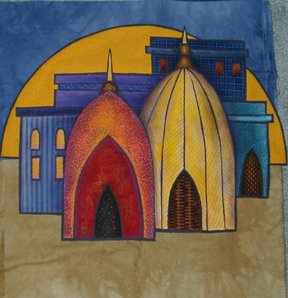 Now I needed to try out some background fabrics. I bought these two beautiful hand-dyes from my sister-in-law's business and thought they might work. Sorry—those colors are too dead for the rest of the piece. But they will be great for something else.
 I found two good possibilities in my stash. The stripe is really old, but I have always loved it and knew someday it would be the perfect piece for something. The purple, dotty fabric is newer. I love them!
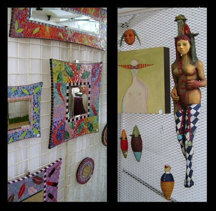
 For the past 10 years there has been an art festival called "Art in the Pearl" over the Labor Day Weekend in Portland's Pearl District. We usually try to go and have even bought art there at least once. It is held in the Portland North Park Blocks, which is a beautiful, tree filled series of grassy blocks, lined with nice old buildings.
 arnival atmosphere of the art festival, you could still see a few of the transient residents lurking about. This woman seemed to find it no problem to sleep despite the crowds and the bands performing nearby. There was something quite sad about people streaming past her as if she wasn't even there.

 That's Ray wandering among some wonderful kinetic sculptures. The parts turn slowly in the breeze. Across the street is the US Customs House, one of the grand old government buildings up toward the end of the Park Blocks.
 Both Carla and Dianna said my "Landmark" resembles the Sydney Opera House. I can see the resemblance in the gothic arch shape and also the horizontal rectangles. Interesting. I didn't have the Opera House or any other actual landmark in my mind at all. Maybe it was there subliminally.
 Well, I ended up going with neither option. I decided the two ideas I showed yesterday both had too much going on and went with a much simpler composition.
 OK, so this is the idea that I have been pondering. Some sort of architectural thingie. Some sense of structure, but in the abstract. This is small. It measures about 5.5" x6" and I think it is supposed to be part of a larger, though not too large, piece.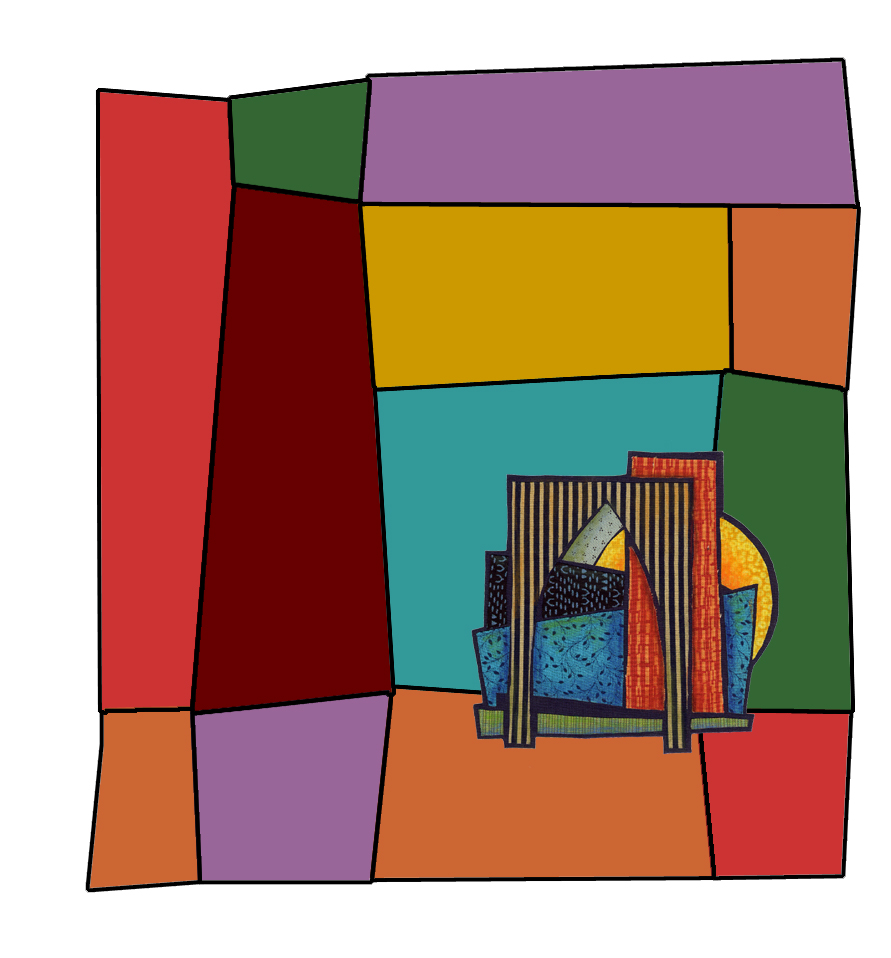
 Here's another version. Smaller background—same basic shapes as the other one. Darker colors. I think I like this better. I'm still thinking.
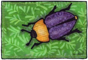 I made a couple more postcards for Fiber Art for a Cause. You may recognize the beetle motif. I made some larger beetle pieces several months ago and thought they would work for the small format postcard size as well.
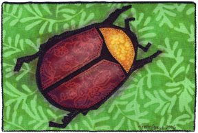 I now have seven altogether to send. It would have been nice to send more, but I am quite happy with these and if all sell at $30 each that will be more than $200 for the American Cancer Society.
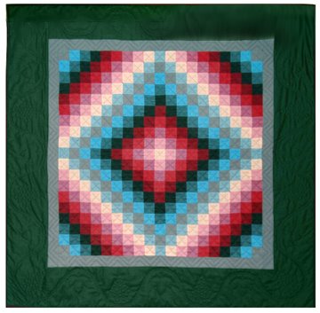 Years ago (about 20), at the beginning of my quilting career, I became enamored of Amish quilts—specifically those made in Lancaster county, PA during the first half of the 20th century. After seeing the Esprit collection at the deYoung Museum in San Francisco, and then a trip to Lancaster County, I made my own version of the "Sunshine and Shadow" design, a particular favorite of mine.
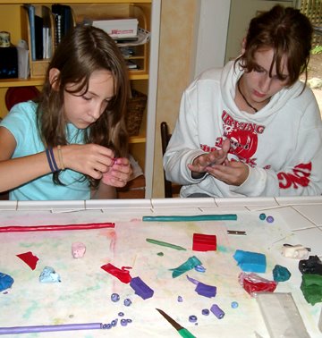 Today I showed my nieces, Steffi and Jamie, how to make Fimo beads by first making canes with a design that can be sliced and applied over and over.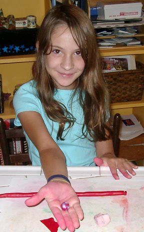

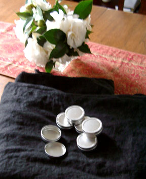
 Here are our completed beads and some tins to put them in that we covered with Fimo. Remember when I bought these nice little tins at S.C.R.A.P. back in April? I knew I'd find a use for them.
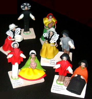 We had a party last Saturday. Our friends and family came to welcome my daughter and son-in-law to Portland and to celebrate their marriage, which took place a year ago in Ecuador. Emily's college friends and work colleagues came and brought their beautiful children. Our brothers and sisters and their families came. Dear friends and relatives came. North Americans, South Americans. The sun shone and a nice breeze kept it from being too hot.
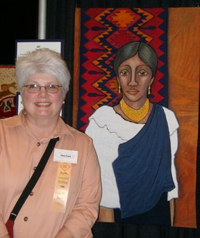 Here is my quilt "The Weaver" hanging in the show. It is always interesting to see your own work hanging. It looks different than it did at home. For me, it always looks smaller and a little dull. I tend to use a subdued color palette, so when my work is surrounded by work in really bright, bright colors it washes out.