
Before I get started, I just want to reiterate that these are just my opinions. It's your blog and you can do whatever you want with it, even use one of those butt-ugly, gross-colored templates, and I'll probably keep reading if you have something interesting to say, but I'll probably keep wondering what you're thinking.
- So, since I already brought it up, I like blogs with white backgrounds, especially if you are showing your art or pictures of beautiful flowers or scenery, or any pictures actually. A lot of people use the same white, very plain template I am using. It seems to work nicely for a lot of things. I'm not too savvy about code and such, but I did figure out how to change the colors of the title box and titles.
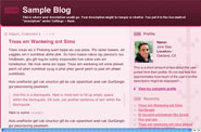
I don't like blogs with colored backgrounds. I especially don't like this pink and burgundy number. It sets my teeth on edge. I'm sorry, but your pictures just don't look that good on that pink background.
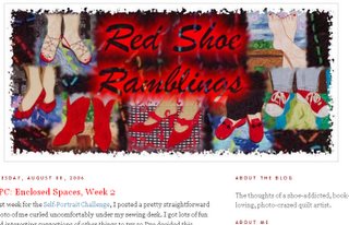
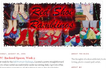
- I like personalized banners at the top of a blog. Deb Richardson's new "red shoes" banner is great, isn't it? I wish I knew how to do that. I can create the banner, I just don't know how to get it on the blog. If someone can point me to some directions I'd appreciate it.
- I like to see a photo of the blog owner up in the corner of the blog. I just identify better if I have a visual of who is talking. Some people put a picture of themselves as a child. Cute, but doesn't help me feel more connected. Likewise, a picture of their art doesn't do it either.
I will concede that there probably are some people who don't need to include a picture. If you're in the Witness Protection Program, I can cut you some slack. - I don't like ugly or goofy fonts.
Courier is an ugly font. This is Courier. It is the font you may recognize as the classic typewriter font. There is a reason it is obsolete. Reading it is tiresome. Every letter has the same spacing, so it takes up more space and just looks ugly. Proportional fonts are a vast improvement and one of the reasons that computers replaced typewriters. There is no reason to use Courier—ever. But, alas, there are blogs out there written entirely in Courier.
Comic Sans is a goofy font. Did you know there is a web site devoted to banning Comic Sans? http://bancomicsans.com/ Fortunately Comic Sans is not available as a text font in Blogger, but a lot of people like to use it for banners and graphics.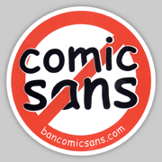
- I like blogs that are updated regularly—well, duh, who doesn't? June and Jerry Underwood's blog is updated every single day! That is laudible and highly unusual. I don't expect that kind of consistency from everyone, but I wonder why some people even have blogs. I have one on my list to look at that was started in February and has 5 entries. That is less than one entry a month. They have all been interesting, so I keep going back to see if there is more, but, no. I'm taking it off my list.
- I like artist's blogs, but I enjoy hearing about more than just their art. I enjoy cute grandchildren, and pictures of new shoes, and reports on trips and unusual sitings and even the occasional recipe. I don't like bitching and complaining. I recently read someone's blog where she listed all the things she doesn't like about her husband. It was not intended as humor. It was pretty serious. Yikes! I don't want to read that.
- I don't like memes and quizzes. Filler with little to no entertainment or enlightenment value.
- I like lots of good photos. I don't like little tiny photos that you have to click to get the view that is big enough to make out. I especially like when people go to some effort to create really beautiful photos. This blog is one with great photos. (note the nice white background template she uses) I try for good photos. Sometimes I am more successful than other times. Here's another blog with beautiful pictures, however she has been in a holding pattern for several weeks now. I hope she's busy taking lots of new photos.
- I like music in general. I don't like it on blogs. Eeeeeee! That same song, not of my choosing, over and over and over—makes me very cranky.
- I like lists of 10 items. Seems nice and neat and well-rounded, but, alas, I can't think of a good tenth item.

Ah, yes, I'm with you on most of that - esp. the ugly fonts and coloured backgrounds. I will consider using a photo of myself, but it won't be easy so don't be surprised if I fail! And I also have quite a penchant for lists.
ReplyDeleteI'm with you on most of it, Terry, although I love memes and quizzes (not just doing them, but reading others' answers) and I like Comic Sans font - but not all the time. I couldn't stand an entire blog written in CS, but I like to use it to write informally on photos.
ReplyDeleteIf you have a banner and just need to know how to add it to your template, go to any blog that has a customized banner (mine included) and on your toobar click on "view" then "page source" (in Firefox...not sure in IE, but it should be similar). Scroll down about 1/3 of the way and you'll see where I have mine inserted into the code - it's called something like "rsrbanner" - then just find the same place in your template and put your banner code there. Hope that makes sense!
I'm back. I have serious jet lag and I agree with you on most all of this. I do post some small pics that need clicking when I am posting a lot of photos about one place or event so that the page will load faster for people. Then I figure if they are interested, they can click for a larger view. I'm tired. Nighty night!
ReplyDeletePS: I just love all of your post cards. You are a wonder!!
Thank you Terry! Well Deb makes it look easy. I tried and tried to get a banner on my blog and it did not look right so I gave up. I will pursue it again when I have a little free time. I do like the large pics, except I worry about people with dial up...and wonder sometimes if my blog is just too heavy to load. But I LOVE the big photos. And since I am really not a photographer and am just learning, it is always fun to download a bunch of photos and see which ones actually have turned out ;) And I am always amazed. I am going to sign up for a weekend class soon to learn to use my new digital camera ;)
ReplyDeleteAnd I also don't like the color backgrounds, but that is just my personal perference. Have a great week.
Cheers, Kim
I agree with you on most of this, Terry! (Probably because mine fits most of the criteria, ha, ha!!)
ReplyDeleteBy the way, did you know that if you read blogs in an rss reader like Awasu (which you download to your computer and use like a browser) you can read everything just on a white background! Mind you, you don't get to see the fancy banners that way - you have to click on the blog name and the actual blog comes up then! Also, it gets round the problem of those blogs which aren't updated regularly, because you just see which blogs are highlighted to see which are updated.
I love quizzes and memes! And comic sans is my favorite font.
ReplyDeleteBut I agree I don't like angry complaining blogs.
I agree with a lot of these things, but some of your things require sameness from everyone. I like different fonts and backgrounds, as long as the page is still readable.
ReplyDeleteI like meme and quizzes too - I find out things that I might not find out otherwise.
Thanks for posting the interesting blogs - there are some very good amateur photographers out there.
ReplyDeleteLove the fabric postcards - thanks for sharing.
Terry, you made me do it! I've been wanting to change my blog template for ages and you prompted me. It's pretty plain vanilla right now, but you are right: the pictures look SO MUCH NICER!
ReplyDeleteI agree! Reading blogs and enjoying wonderful photography has made me a better picture taker.
ReplyDeleteVery interesting - I love how some people are "cued in." You like or don't like some things I never even notice. (Like, "Is my background white?" Yes it is...)
ReplyDeleteI have always found that I can read better on white, I guess it is a throwback to when I worked in marketing communications and all the surveys and research said the same. My blog pretty much fits all your requirements except for the banner. I just haven't gotten around tuit. /paula
ReplyDeletethanks for your list of ten -- I like them better than the tips of the cited quilter above --
ReplyDeleteI DO allow myself to rant now and then -- it's one of my categories -- but mostly I'm ranting about my own idiocy...
The font formerly known as the typeface "Hobo" is pretty awful, too. I'm with you, clean and uncluttered. I like lots of visuals. People who are long-winded, in life or in print, tend to lose me (don't ask about the quilt guild meeting from hell earlier this month. Only 11 more months until we get a more concise president that actually speaks English).
ReplyDelete